A Journey from Design through to Web, and that's just the start
Needs, goals, MVP, Elements, Wireframes, Mobile-first, HTML, Skeleton and CSS
by: Peter Torr Smith
10th September, 2018
Tags/Categories
What a responsive site is, and why responsiveness is important?
Elements and shapes resize and flow to optimally present the content on devices of all sizes
What mobile first design is, and why it's important?
building the site to work on a small 'mobile' screen (e.g. a Watch even), and then have the elements grow and appear as the screen size permits.
What frameworks are, and their pros and cons?
Bootstrap is common, powerful. Skeleton is good to learn quickly to get a basic mobile-responsive page built-up.
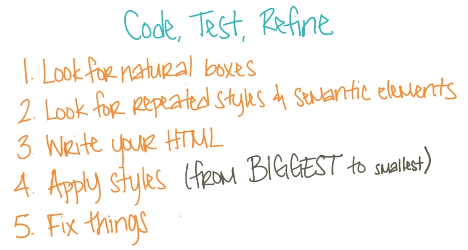
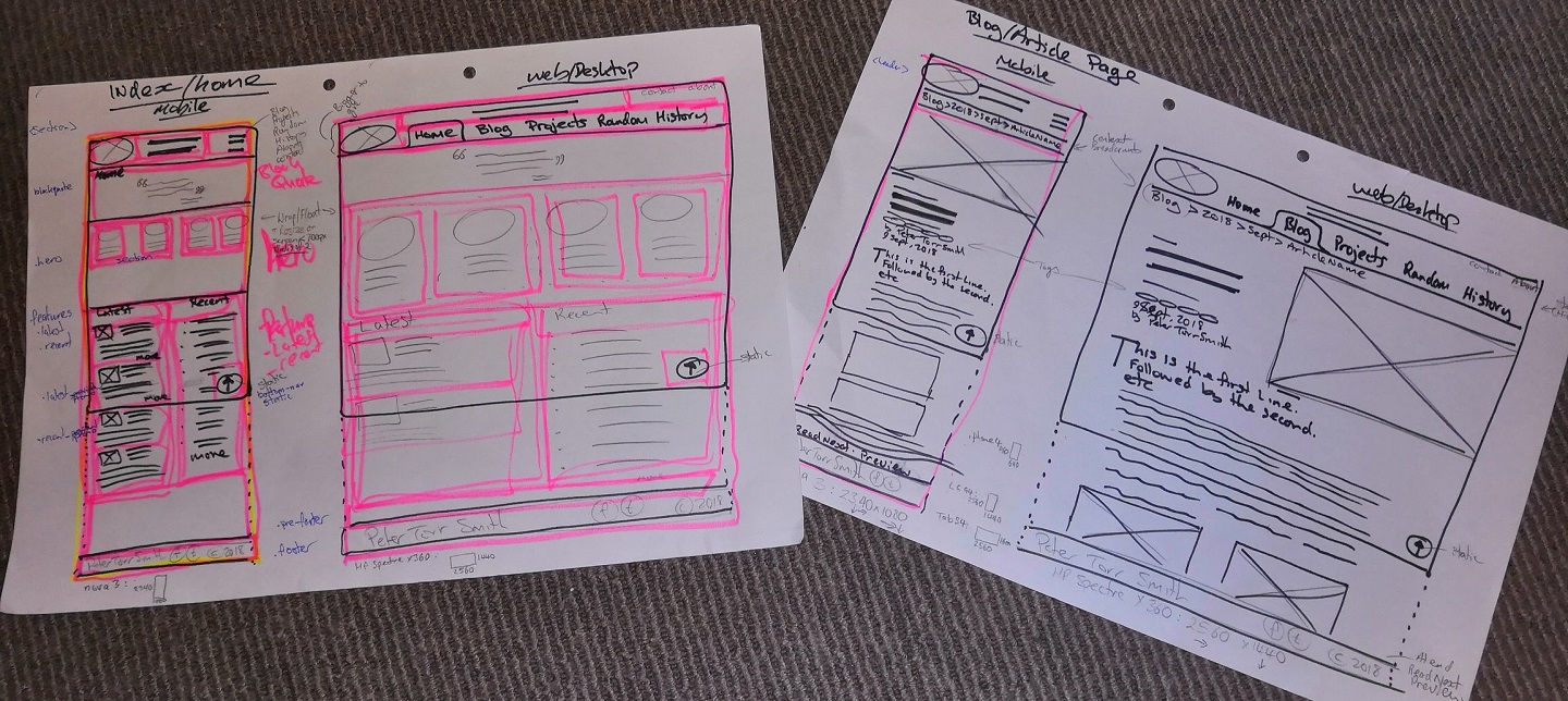
What a wireframe is and why we use it?
A low-fi, often initially hand-drawn, diagram of the main elements and content on a screen of different sizes.